
Color in Visual Merchandising: Using Color to Sell
How to use color in visual merchandising: building a palette, using contrast, colour and mood, seasonal themes and the role of coloured mannequins.
Color in visual merchandising is one of the fastest ways to catch a shopper’s eye, set a mood and guide attention to the product you most want to sell. Used well, colour builds brand recognition and lifts conversion; used carelessly, it creates noise. This guide explains how to use colour in visual merchandising — from palettes and contrast to seasonal themes and the role of the mannequin itself.
Why colour matters in retail
Colour is the first thing a passer-by registers, often before they read a sign or recognise a garment. It signals brand personality, creates emotional tone, and can make a single product the clear hero of a display. Because colour works from a distance, it is a powerful tool for windows and store entrances where you have only a second or two to stop someone.
Building a colour palette
Start from your brand colours, then choose a small, disciplined palette for each display — typically one dominant colour, one or two supporting tones and a neutral. Use the classic relationships: complementary colours for high-energy contrast, analogous colours for a calm, cohesive look, and a single accent to draw the eye. Keeping the palette tight stops a display looking busy and keeps the product in focus.
Using contrast to guide the eye
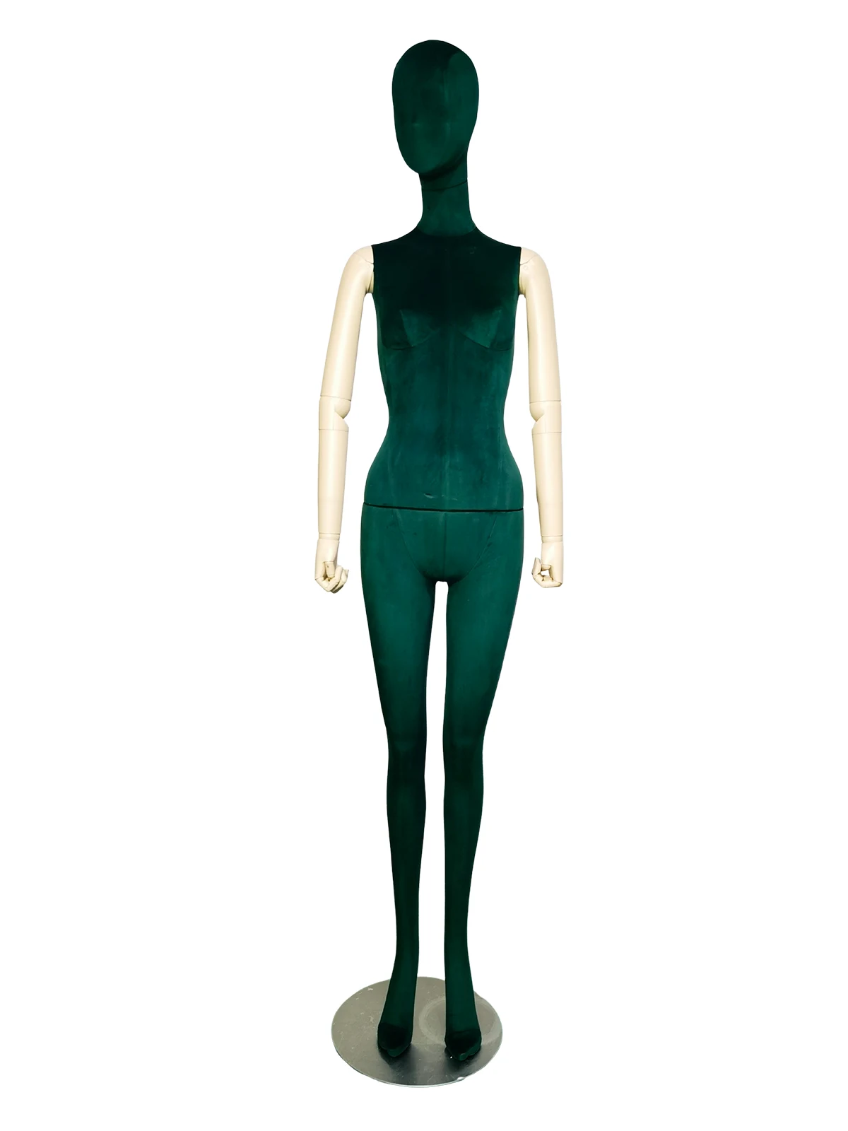
Contrast is what makes a focal point read. Place a light garment against a dark ground, or a saturated accent against neutrals, so the eye lands exactly where you want. A coloured fabric-covered mannequin — for example a rich velvet in a seasonal tone — can itself become the contrast, framing a neutral outfit or echoing a key colour in the collection. For more on directing attention, see our guide on visual hierarchy in a window display.
Colour and mood
- Warm tones (red, orange, yellow) feel energetic and urgent — useful for sale and impulse zones.
- Cool tones (blue, green, violet) feel calm and premium — useful for considered, higher-value displays.
- Neutrals (cream, taupe, grey) feel refined and let the product speak — a staple of luxury retail.
- A single bold accent adds energy without overwhelming a neutral scheme.
Seasonal and campaign colour
Rotate display colour with the season and campaign calendar so the store always feels current — fresh brights for spring, warm earth tones for autumn, deep jewel tones for the holidays. Custom fabric-covered mannequins let you match a seasonal palette exactly, and can be re-covered as themes change so the investment carries across campaigns.
Common colour mistakes to avoid
- Too many competing colours, so nothing stands out.
- Colour that clashes with the garment instead of framing it.
- Ignoring lighting, which shifts how colours read on the floor.
- Inconsistent colour across windows and store, weakening the brand look.
Frequently asked questions
Why is colour important in visual merchandising?
Colour is the first thing a shopper notices and works from a distance, so it stops passers-by, sets a mood and guides attention to the hero product. Used consistently, it also strengthens brand recognition.
How many colours should a retail display use?
Keep it disciplined: usually one dominant colour, one or two supporting tones and a neutral. A tight palette keeps the display from looking busy and keeps the product in focus.
How do I use contrast in a window display?
Place a light garment against a dark ground, or a saturated accent against neutrals, so the eye lands on your focal point. A coloured mannequin can provide that contrast while framing a neutral outfit.
What colours work best for luxury displays?
Neutrals such as cream, taupe and grey read as refined and let the product speak, often with a single deep jewel-tone accent. Cool tones also feel calm and premium for considered, higher-value displays.
Can mannequins be made in custom colours?
Yes. Fabric-covered mannequins can be produced in custom colours and finishes to match a brand or seasonal palette, and can be re-covered as themes change so they carry across campaigns.
Want mannequins in your brand colours? XINTU is a custom mannequin manufacturer in China producing fabric-covered mannequins in custom colours and finishes — including seasonal palettes and re-covering — for fashion brands, boutiques and retailers worldwide. Share your colours, quantity and reference images for a quote. Contact us.