
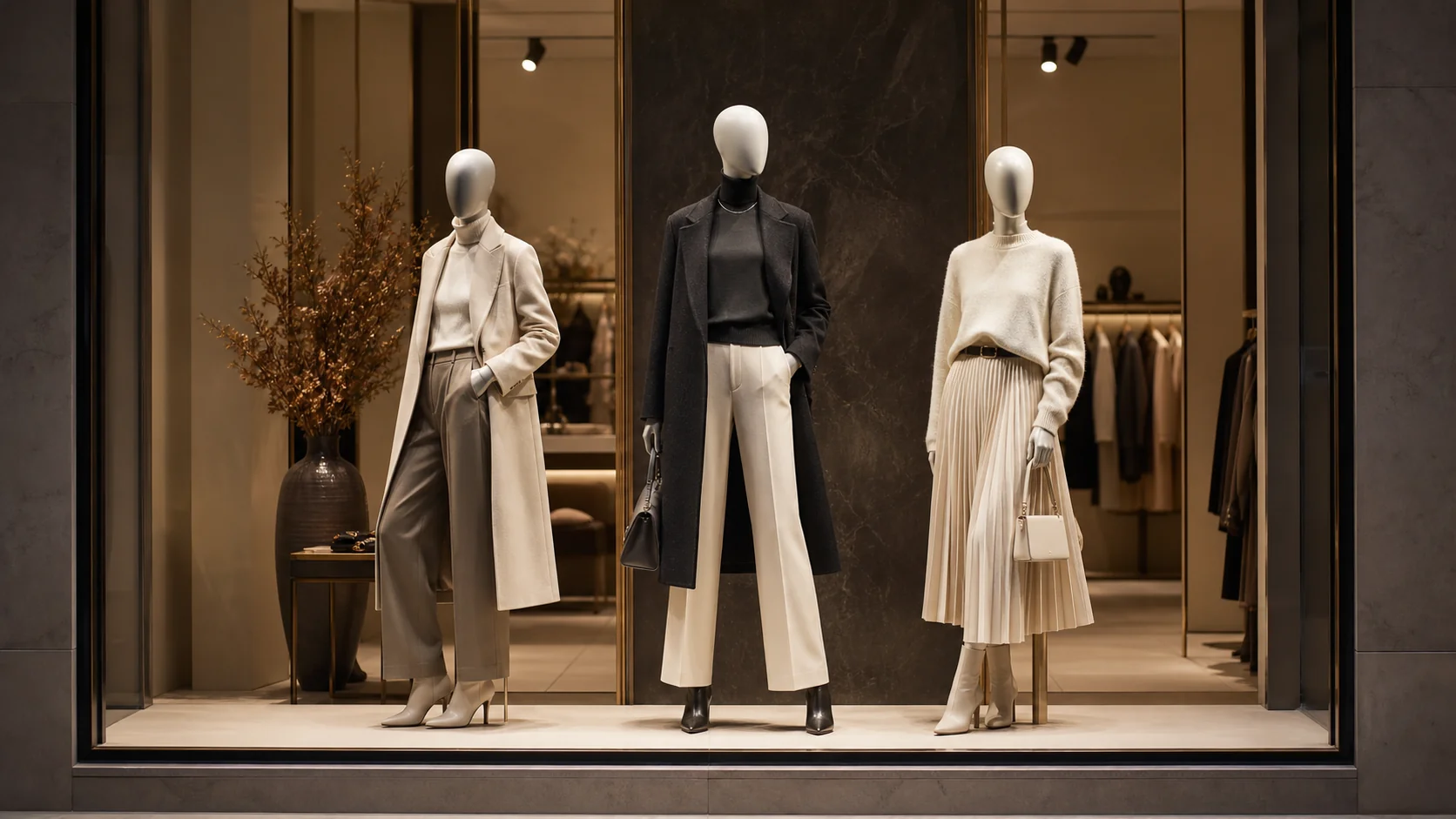
How to Create a Strong Visual Hierarchy in a Window Display
A successful window display should communicate one clear idea before a shopper notices individual products. Visual hierarchy gives the eye a path: first the main story, then supporting looks, and finally details that reward a closer view.
Start with one focal mannequin
Choose the outfit that best represents the campaign and give it the strongest position. The focal mannequin may sit near the optical center, stand slightly forward, or receive the most concentrated light. Contrast in color, pose or elevation can establish priority without making the arrangement feel forced.
Build supporting groups
Use remaining mannequins to create a triangle, gentle diagonal or asymmetrical cluster around the hero. Varying plinth height and pose angle creates rhythm while keeping the group connected. Avoid identical spacing, which often reads as inventory rather than a curated story.
Control color and repetition
Repeat one or two colors across the display to link the looks. A neutral palette can feel premium when texture, silhouette and lighting provide variation. If the collection is colorful, reserve the strongest hue for the focal area and echo it in smaller accents.
Protect negative space
Empty space helps shoppers understand the composition from a distance. Leave breathing room around heads, hands and key garment shapes. Check the display from the pavement, from both approach directions and at night.
Use lighting to finish the hierarchy
Layer broad ambient light with focused accents. The brightest point should reinforce the primary mannequin, while softer light keeps secondary figures legible. Test for hard shadows, glare on glossy finishes and dark gaps.
A practical checklist
- Can the idea be understood in three seconds?
- Is one mannequin clearly the focal point?
- Do supporting figures lead the eye?
- Are colors and props connected to the product story?
- Does the hierarchy work from every viewing angle?
Strong hierarchy is not about adding more elements. It is about assigning every element a clear role so the display feels immediate, memorable and easy to shop.