
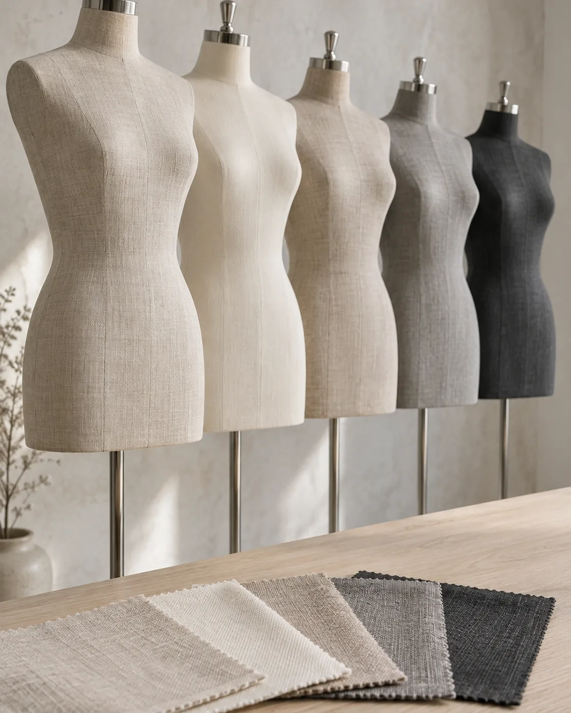
Choosing Mannequin Fabric Colors for Your Store
How mannequin fabric color affects the way garments read, which shades suit which interiors and merchandise, and how to test swatches in store so the fleet still works three seasons from now.
The fabric color of a mannequin is one of the few decisions in store design that is both permanent and everywhere. Fixtures can be repainted and lighting re-aimed, but a fleet of forms covered in the wrong shade will stand in every window and on every floor until it is re-covered. It is worth getting right at the specification stage.
This guide explains how fabric color affects the way garments read, which shades suit which interiors and merchandise, and how to choose a color that will still work three seasons from now. It applies to fabric-covered display mannequins; painted and lacquered forms follow different rules.
What the mannequin color has to do
A display mannequin has one visual job: make the garment the most important thing in view. The fabric color supports that in three ways.
- Contrast with the garment. The form should separate from the clothes at the neckline, cuffs and hem so the silhouette is legible. A cream form under a cream knit loses the edge of the garment.
- Contrast with the backdrop. The form must also separate from the wall or window behind it, or the whole display flattens into one tone.
- Consistency with the brand. The color signals positioning before a customer reads a label. Warm naturals say craft and quiet luxury; charcoal and black say fashion-forward or menswear; pure white says gallery.
Most color problems come from optimising for only one of the three — usually the brand — and forgetting the other two.
The common palette and what each shade does
| Fabric color | Character | Works with | Watch out for |
|---|---|---|---|
| Natural linen / ivory | Warm, tactile, artisanal | Wood, stone, warm whites; earth-tone and pastel collections | Disappears against cream walls; can look yellow under warm LEDs |
| Oatmeal / greige | Neutral, contemporary, forgiving | Almost any interior; the safest all-round choice | Very pale garments lose their edge |
| Warm grey / taupe | Understated, premium | Concrete, plaster, mid-tone timber; monochrome collections | Can go muddy under mixed daylight and tungsten |
| Cool grey | Clean, technical | White and steel interiors; sportswear, denim | Reads cold with warm wood and brass |
| Charcoal / black | Dramatic, editorial | Dark or high-contrast stores; menswear, eveningwear, bright colors | Shows dust and lint; swallows dark garments |
| Brand or accent color | Distinctive, ownable | Flagships and pop-ups with a strong identity | Fights with most merchandise; dates quickly |
Across premium fashion the most-specified choices are the first three. They are neutral enough to carry every collection, warm enough to suit the natural materials most luxury interiors use, and quiet enough that the garment always wins.
Choosing against the interior, not the swatch
The most reliable way to choose is to test physical swatches in the actual store, or in a photograph of it, rather than on a white desk. Three checks:
- Hold the swatch against the main wall finish and the floor. You want a visible step in tone — lighter or darker — not a match. A form that matches the wall vanishes; one that sits one or two steps away reads as a figure.
- Look at it under the store lighting. Warm LEDs push ivory toward yellow and grey toward brown; cool lighting makes linen look grey. If the store has daylight from windows, check morning and afternoon. Our retail display lighting guide explains color temperature.
- Put a garment on it. Drape a piece from the current collection and a piece from the palest range you sell over the swatch. If either loses its outline, move a step darker.
Where a chain has several store concepts, pick the color against the most common one and check it still works in the others. It is usually better to have one fleet color that is good everywhere than three that are perfect in one store each and cannot be moved.
Color and garment categories
Merchandise mix shifts the answer:
- Womenswear with a broad palette — oatmeal or warm grey. Neutral enough to sit under pastels and brights alike.
- Menswear and tailoring — warm grey, charcoal or a darker linen. Suits read best against a mid-to-dark form; a pale form under a navy jacket looks like a collar gap.
- Knitwear and natural fibres — natural linen. The texture of the covering echoes the product.
- Bridal and eveningwear — ivory for bridal, charcoal for evening; see our bridal mannequins guide.
- Sportswear and denim — cool or mid grey, sometimes black, to match technical interiors.
Some brands run two fleet colors — one for womenswear, one for menswear — and keep them strictly to their departments so the store still reads as one system.
Texture matters as much as color
Two fabrics of the same shade can look very different on a form. A slubby linen shows weave and catches light at the seams; a fine cotton twill reads as a flat tone; a brushed or velvet finish absorbs light and looks darker than its swatch. Heavier textures suit artisanal and heritage positioning and photograph with depth; smoother finishes suit minimal and contemporary stores and hide handling marks better. Our guide to fabric texture, color and performance goes into the weaves, and our custom finishes guide covers how the covering is specified.
Practical considerations: fade, soiling and matching
- Sun fade. Forms in windows fade faster than forms on the floor, and warm naturals show it as yellowing while greys shift toward brown. Ask the manufacturer for a fabric with UV-tested dye, and rotate window and floor forms if you can.
- Soiling. Pale fabrics show marks from dressing; dark fabrics show lint and dust. Mid-tones hide both best. See our cleaning and care guide for what lifts safely.
- Batch matching. Fabric dye lots vary. Order the whole fleet — including spares — from one lot where possible, and record the fabric reference so a later top-up or re-covering can be matched. “Warm off-white” is not a reference; a supplier code or Pantone is.
- Coordinating parts. Decide whether wooden arms and heads are natural timber, stained to sit with the fabric, or covered in the same fabric. Natural timber with a warm fabric is the classic combination; a cool grey fabric with a warm oak arm can clash.
Custom colors and brand matching
A fabric dyed to a brand color is possible and can be striking in a flagship or a pop-up. Three things to weigh: it usually means sourcing fabric rather than using a stock range, which adds cost and lead time; it commits the fleet to that color for its whole life; and it competes with the merchandise more than a neutral does. Where a brand wants an identity note without the risk, a colored base plate, a stained arm finish or a small label on the form does the job and can be changed later. Our article on what drives custom mannequin cost explains how a sourced fabric affects the quotation.
A simple way to decide
If you have no strong reason to do otherwise, start with oatmeal or a warm grey in a mid-weight linen blend, test the swatch in store under the real lighting with the palest and darkest garments you carry, and adjust one step lighter or darker from there. That process takes an afternoon and avoids the two expensive mistakes: a fleet that disappears into the wall, and a fleet that fights the clothes.
We keep a stock range of linen and cotton coverings and can send physical swatches for testing in your store. If you are choosing a fabric color for a new fleet or a re-covering project, send us a photograph of the interior through WhatsApp or the quote form and we will suggest the two or three shades most likely to work.